I really struggled with the title for this post given Stuart‘s dismay at some of the vocabulary used recently to describe the new Notes 8 UI!
“I’m with you on that old chap, we can’t be having with these god-awful abuses of the language!” spoken in the appropriate accent!! 😉
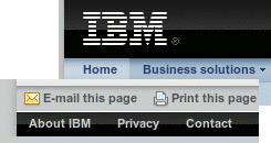
 Anyway, what I wanted to mention was what appears to me to be some pretty subtle but interesting changes I have noticed on the IBM website lately, or is it just me? I may well be late on this, but it looks like the design team have been busy giving things a more crisp and modern look, complete with glossy effects and new icons.
Good to see IBM really showing they are getting this “Web 2.0 thing” in so many ways!
Oh, and me likes!


Join the conversation!